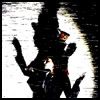
Today we will be making these icons (one or the other, your choice... doesn't really matter until the very end anyway):
 or
or 
Step 1: Get your image ready! Here I've chosen a nice screencap from "Xana's Kiss..."

Step 2: We're going to crop it now. (It's much too big to be used as an icon, don't you think?) Get your selection tool...

Now, it's very hard to make a perfect selection when you're doing it freehand. So let's change that. In the upper-middle of the screen, there are some options that look like the image below. In the pull-down menu, choose "Fixed size" and enter some numbers into the feilds next to it. Make sure they're the same, and they aren't bigger than your image already is. I've chosen 400x400 here.

Now, click the image and drag your selection box to where you want it. (Everything outside of the box will be taken off.) Finally, go to Image>Crop.

Step 3: Looks good, but still too big. Go to Image>Image Size to change that. A window will come up like the one below. Make sure the "constrain proportions" option is checked, and then scale the image down to 100x100 pixels. (Only mess with the first two feilds! Do not mess with the Document size.)

You should have this:

Step 4: Looks good, but still not anywhere near ready. First thing to do is get rid of that Cartoon Network logo, which, in this base, is conveniently placed right over a nice solid-colored background. Easy fix. What we're going to do is get the Healing Brush tool, which looks like a Band-aid:

Now, it's much easier if you zoom in on your image to do this. Right-click on the image and set the width of the healing brush to a nice, comfortable size (I used about 4 px for this icon). Then, hold down the ALT key while clicking in the tanish-colored area behind the logo. Once you've done that, release the ALT key and scribble over the logo until it's gone.

Step 5: Looks good... for a bland little icon base. We're not finished yet!
The base is a little bit fuzzy, so we're going to sharpen it up. To do that, go to Filter>Sharpen>Sharpen.

Your base should now have a crisp look to it.
Step 6: Now comes the fun part! We're going to give this icon a nice dramatic color to emphasize the feelings between poor Jeremie and Aelita in this scene. Go to Image>Adjustments>Levels... and this window will pop up:

Now, you can mess around with this any way you want to, but I've done the following:
-Under the RGB option, I've moved the triangle on the right a little bit to the left, which made the icon lighter.
-Under the Red option, I've moved the triangle on the right a little bit to the left, which made the icon redder.
-Under the Green option, I've moved the triangle on the left a little bit to the right, which took away some of the green in the icon.
-Under the Blue option, I've done the same as I did with the green.
The result is this:

Step 7: Now we need to give our icon a little border so that it looks a little neater. Let's give this one a basic black one-pixel border. On the toolbar, right-click on the selection tool and pick the Single-Row Marquee Tool...

Now, on the image, click and drag it over to the top of the icon. Get your normal brush (it's right next to the healing brush tool) and set the color to black. Then, color over where you made your selection. When you move the selection, there should be a nice, straight black across the top. Do the same on the bottom.
Now go back to the toolbar, right-click on the selection tool, and click on the vertical Single-Row Marquee Tool. Finish off your border by dragging the selection to each end of the icon and filling the selections in with black.
You should have this:

Step 8: Time for some text! For this icon, I've used Aelita's quote, "Trust Me..." Like I told you at the beginning of this tutorial, there are two ways I'll be walking you through adding text to the icon. Here's the first way, which is slightly more conventional.
The font I used for this icon is called Terminal (you probably have it or something like it on your computer) set to about 6pt. I also set the drop down menu with the two little a's by it to 'none,' which made the text nice and crisp.
The options at the top of the screen look like this now:

Now that I've clicked on the image and typed in the text I want, it's time to add a border around the text to make it look good. To do that, get your Layers window ready, select the Text layer, and then click the little button at the bottom of the window that looks like a funny letter 'f'. A menu should drop down with lots of options on it. At the very bottom is one called "Stroke." Click on it.

A window will pop up...

The default settings here will put a 3-px red border around your text. You probably don't want that. Change the size to 1 px, and then click on the color box to make it black. Click OK.
Congratulations! You're all done!
I mean, unless you want to do the text differently and make it a little artsy like this version of the icon:
For this version, I've changed the text color to a dark brown, which contrasts well with the rest of the icon. The font is just a normal Times New Roman-ish looking one (I don't remember exactly the name of this font, but any font that looks like it will do) set to about 8 px. The font style that we had originally set to 'none' (see above) is set to 'sharp' here instead.
That's about it! Of course, with this tutorial, you don't have to make icons with it... You can make banners, backgrounds, buttons... anything you can think of. I hope it was useful and semi-easy to understand.

PS: If you would like to use either of the icons made here, link back to lyokofreak.net. Thanks.